Ted Seth Jacobs: An interview with the artist
by BeyondCommunion.com, 6 Oct 1999
Ted Seth Jacobs' artistic activities span fifty years, beginning in New York
City and continuing in France, where he now enjoys an environment where “the
local red wine is very good and cheap as water!”.
In 1987 he created his own art school in Les Cerqueux,
which usually sells out two years in advance. There, he teaches developing professional
artists his own style of painting and drawing, known as “Restructured Realism.”
He is author of two books on art, including Drawing with an Open Mind
(in print) and Light for the Artist (sold out). He has recently completed
two more books, yet to be published, and will later be creating a definitive
text on understanding the human form.
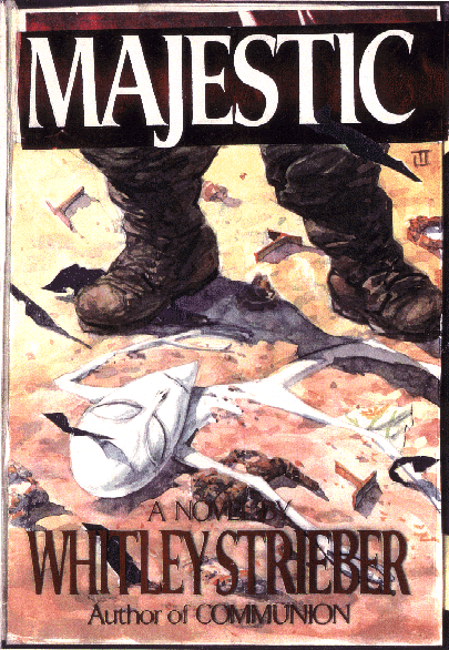
His commissions include the covers of Whitley
Strieber's Communion, Transformation, and Majestic, as
well as portraits (all done from life) of the Gerrit Copeland family, the Paul
Roebling family, the Edward Elliman family, the Phipps family, Peter Stephaich,
Jane Fonda, James Earl Jones, Lawrence Fleischman, Fred Woolworth, M.R. Schweitzer,
Mrs David Seifertheldt, Mrs Theodore Stebbins, R.K. Mellon and many notables
in the world of dance and theatre.
We caught up with Ted Seth Jacobs at his home,
“Mes Illusions,” a seventeenth-Century house in a rural Anjou village
that he has restored and decorated. He has turned it into a unified work of
art with many walls painted in trompe-l'oeil murals, and hung with one hundred
of his paintings and drawings. “Mes Illusions” opens to the public
as a museum for a handful of days each year, as well as by appointment.
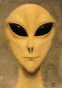
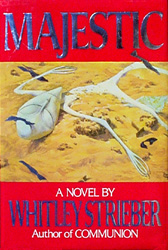
Q: The Cover Art — Communion is a classic image in our culture. I've heard of many people who are unable to bear to look at the cover, and as many who find it almost alluring. There's a trace of a smile on that figure that I've always found interesting. I'd love to ask you about how you came to paint that figure, what the process was and what your interest in the subject may be. Before we get to that classic image, though, I wonder if you could tell me a little bit about a mystery. When I designed my Whitley Strieber website, I came across an image of what seems to be an alternate version of your cover art for Majestic. It featured a soldier standing above a deceased alien being on the desert sand. When the book was produced, the soldier had been “painted out” of the scene.
Well my friend, you have touched what is a sore spot with me, about the Majestic cover illustration. I originally produced what in my humble estimation, was the perfect graphic synthesis of the story. It was an image suggesting the opposition of Authority and the Alien Phenomena. Whitley had emphasized the delicate fragile nature of the alien, and I contrasted it with a rather unfeeling brutal earthling standing over the fallen creature. To me, it was a rather terrifying image. I also personally think it would have sold the book much more successfully. Whitley had told me that the Communion cover had become a classic in the publishing field. As you may infer, my most endearing quality is my modesty, but I feel all this is only the truth as I perceive it! When I received a copy of Majestic, I was stunned and outraged. My painting had been completely emasculated. All the impact was gone. I was also offended to see that some of the light effects had been altered. This may not seem so important, but I am considered an authority on effects of light as applied to painting, and have a published book on the subject (now out-of-print) titled Light For The Artist. I also have a long ongoing career as a teacher, and my emphasis is on the interactions of light and structure, or form.
Q: Would you share your reflections on your painting for Whitley Strieber's Communion? Were you pleased with the painting? And were you consciously trying to convey a female alien being, and if so, how did you go about this without the standard clues that reveal gender?
The Communion cover, on the other hand, was not tampered with. It was
painted in my small apartment on East 83rd St, in NYC. Whitley sat with me first
for a drawing of the Alien. As I sketched, he would indicate how to change the
portrait so that it would more match what he saw. It was, I believe, the process
used by police sketch artists. Every least detail was corrected according to
his instructions. At one point, he said the image corresponded exactly, but
exactly, to what he had seen. With Whitley beside me for the subsequent session,
I began to paint the image on a wooden prepared panel, going through the same
process as for the drawing, until Whitley finally said the image was exact.
I had the picture hanging in my apartment for about five days while the paint
dried thoroughly. If I may mention a completely subjective anecdotal impression,
the thing was scary as hell! It had a powerful presence, very penetrating and
somewhat hypnotic.
As to the gender of the Alien image, to tell the
truth, the subject didn't come up. I don't even know if the 'greys' have gender
as we understand it. As was the case with the Majestic alien, Whitley
corrected the developing image to have a certain fragility, a vulnerability.
I suppose we Earthlings usually associate these qualities with femininity.
Q: Would you say a little bit about yourself and how you came to paint this cover?
I had been an enthusiastic follower of the UFO phenomena since the 1940's.
I would buy most of the books that came out, and subscribed to various journals.
In one book, it was mentioned that the then leading researcher into Alien/human
encounters was a man named Ted Bloecher, who lived in NYC. I looked his name
up in the phone book, and found he lived a block away from me. I rang his bell,
and we became quite good friends. Of all the UFO researchers I had met, to my
mind Ted was the most pure. He was interested in the subject for its own sake,
and looked askance at others who greatly cashed in on the results of their researches,
in money or media attention.
Ted introduced me to Budd Hopkins (a fellow artist
and then friend of my brother Jay Jacobs.) Budd asked me if I would be interested
in working with abductees, recreating in graphic form what they remembered,
again, in the manner of a police artist. I was very happy to do that. I also
did a pastel painting illustration, from the description of a young abductee,
that was included in Budd's book Missing Time.
I think it was in the late 1970's or early
eighties, that NBC-TV did a special on the UFO enigma, and I was asked to work
with the abductee who was being interviewed. He didn't want his face shown,
so it was shadowed into obscurity, and the camera was focused from behind me,
on my hands sketching the image. Permit me to mention, that when doing all these
reconstructions, I had the feeling of being in some kind of telepathic contact
with the minds of the abductees, and so able to get such close resemblances.
This however, may only be the ravings of my own deranged imagination!
Anyway, it was through Ted and Budd that I was
introduced to Whitley. In my NYC days, (my wife and I now live in France) I
became quite a close friend of Whitley and Ted, and we often spent much time
in our respective apartments. I also did the drawings used by the model makers
who produced the creatures for the film version of Communion. For a struggling
artist, the whole thing was a nice little cottage industry. I painted a portrait
from life of Whitley, which I hoped would be used as the cover for Transformation.
It was a straight front view, but I painted blacked-out alien eyes on Whitley's
face. Again, I thought it was a very powerful image, very scary! And to me,
it conveyed the essence of the subject. Whitley bought the portrait, but I was
asked to paint another alien image for the cover.
Q: So what is your own view of these phenomena, then?
Once in Boulder Colorado, I was doing a mural in a hotel where a whole convention of UFO experts was meeting - one of those 'synchronicities' so common in the UFO field - including Stanton Friedman, J. Allen Hynek, Jacques Vallee, etc. I made known my interest, and they included me in their lounge discussions. When I met Dr. Vallee, among other things, he said, “In all scientific disciplines, the more data that is amassed, the more one feels a solution is approaching. In the UFO field it is the opposite.” Despite my own ideas of time and reality and “Them,” I deeply feel that concerning anything important, I know absolutely nothing. If you are in touch with Whitley, please give him my best. ~
Buddhists will recognize in Ted Seth Jacobs' closing remarks the concept of the “empty mind” (Jacobs memberships include The First Buddhist Lamasery of America), an attitude of humility from which wisdom can develop. I thank Mr. Jacobs for his extremely pleasant reception and generous discussion.
Addendum: A comment from Whitley Strieber: “...Ted was/is an artist. Not in the UFO field. When we did that face, he worked sort of like a police artist, sketching as I described what I'd seen. We have some of his other paintings, which are quite wonderful and have been on our walls now for over twenty years, and they still draw the eye and give pleasure anew every time you see them. They are not UFO-themed, but I do also have the Communion painting here in this office. I look at it ten times a day, always. Essential.” (Whitley Strieber, writing on his message forum, April 28, 2009)
Alternate Artwork for Majestic
Courtesy of Ted Seth Jacobs
 © 1989 Ted Seth Jacobs |
Ted Jacobs on the watercolor image on the left: “This rendering is what is called a maquette, or mock-up, done before the final version is painted. The dark grey irregular shapes were to be printed in silver, to look like the silver foil that was present on the wreckage site.”
|
|
 © 1989 Ted Seth Jacobs · Click image for larger (1920 x 2792) copy |
This image is the exceptionally rare “proof jacket” featuring Ted Jacobs' finished painting complete with silver foil. |
|
|
 |
|
Ted Seth Jacobs: An Interview with the Artist, 6 October 1999
© 1999 Will Bueché. All rights reserved.
Artwork © 1989 Ted Seth Jacobs. All rights reserved.
Reprinted by permission of the artist.
Introductory paragraph derived from material presented
on Ted Seth Jacobs' official website.
![]()